

Crafting a compelling ROI presentation for directors requires translating technical data into a clear narrative of financial gain, operational efficiency, and strategic value, using visuals and a problem-solution framework they can grasp in minutes.
How do I structure an ROI presentation for a non-technical audience?
Begin with the executive summary, state the problem and proposed solution, detail costs and quantified benefits, present the ROI calculation, outline the implementation timeline, and conclude with a clear call to action. This narrative arc guides decision-makers from pain point to payoff.
Think of your structure as a story with a clear beginning, middle, and end. You start by setting the scene with the current challenge, such as excessive downtime from premature blade wear on snowplows. You then introduce the hero, your proposed solution like a premium carbide blade. The middle of your story quantifies the journey, detailing the investment and the tangible returns, such as reduced replacement frequency and lower labor costs. The climax is the ROI figure itself, and the resolution is the smooth implementation plan. This approach transforms a dry financial report into a persuasive narrative. How can you expect engagement if you don’t first frame the problem they feel every day? Transitioning from the narrative to the numbers, the next step is to visualize that data effectively, ensuring the key points are impossible to miss. Using transitional phrases like “building on this narrative” or “to substantiate this story” helps connect the conceptual to the concrete.
What are the most effective ways to visualize ROI data?
Use simple, high-impact charts: bar charts for cost comparisons, line graphs for performance trends over time, and waterfall charts to build the ROI calculation step-by-step. Avoid complex3D graphs; clarity and immediate comprehension are paramount for a busy council.
The goal of visualization is instant understanding, not artistic expression. A bar chart comparing the annual cost of standard blades versus SENTHAI carbide blades, for instance, creates a stark visual contrast that speaks louder than a spreadsheet. A line graph plotting equipment uptime before and after implementing a new wear part system shows a trend that anyone can follow. For the ROI calculation itself, a waterfall chart is exceptionally powerful; it starts with the initial cost, then visually adds each benefit like reduced maintenance and fuel savings, culminating in the net positive return. Imagine trying to explain cash flow with just text; wouldn’t a simple chart make the financial picture crystal clear? The key is to let the visuals do the heavy lifting, allowing you to narrate the story they tell. After establishing clear visuals, you must anchor them with credible, well-researched numbers, moving from general illustration to specific, defensible data.
Which key metrics should I include to build a convincing case?
Focus on metrics that directly impact the bottom line: total cost of ownership, payback period, net present value, and internal rate of return. Also include operational metrics like mean time between failures, productivity gains, and safety incident reductions that support the financial narrative.
Selecting the right metrics is about speaking the language of your audience while providing undeniable proof. Directors think in terms of financial health and risk mitigation. Therefore, leading with Total Cost of Ownership, which encompasses purchase price, maintenance, downtime, and disposal, provides a holistic view that a simple unit price cannot. The Payback Period tells them how quickly the investment pays for itself, a crucial factor for budget cycles. Operational metrics like a30% increase in mean time between failures for a plow blade provide the “why” behind the financial improvement; they are the engine driving the ROI. For example, a SENTHAI carbide insert might last three seasons versus one, directly cutting procurement and installation labor costs. How do you prove value without connecting durability to dollars? By weaving these metrics together, you create a multi-layered argument that is both financially sound and operationally credible. To organize these diverse data points effectively, a comparative table can be an invaluable tool in your presentation.
How can I compare different solutions or scenarios effectively?
Use a side-by-side comparison table that evaluates options across critical dimensions like cost, durability, performance impact, and risk. This allows the board to see the trade-offs and total value proposition of each choice clearly, moving the discussion beyond just the initial price tag.
| Evaluation Criteria | Standard Steel Blade | Generic Carbide Blade | SENTHAI Premium Carbide Blade |
|---|---|---|---|
| Initial Unit Cost | Lowest upfront investment | Moderate capital outlay | Higher initial purchase price |
| Expected Service Life | Single season, high wear rate | Two seasons with variable performance | Three-plus seasons, consistent wear resistance |
| Total Annual Cost (Incl. Labor & Downtime) | Highest due to frequent replacements | Moderate, hidden costs from mid-season failures | Lowest overall, predictable maintenance schedule |
| Performance Impact | Reduced plowing speed, higher fuel consumption | Inconsistent cutting edge, requires monitoring | Maintains optimal grade, improves fuel efficiency |
| Supplier Reliability & Support | Often fragmented supply chain | Limited technical support | Full vertical integration, ISO-certified QA, and engineering support |
What common pitfalls should I avoid when presenting ROI?
Avoid overcomplicating slides with data dumps, ignoring intangible benefits, failing to address risks and mitigation plans, using jargon, and not preparing for tough questions. The presentation should be a conversation starter, not a lecture, built on transparency and preparedness.
The most common pitfall is assuming your audience will connect the dots themselves. Flooding a slide with raw data, complex formulas, or industry acronyms like “NPV” without clear explanation will cause eyes to glaze over. Another critical error is dismissing intangible benefits; while hard to quantify, factors like improved operator safety, reduced administrative burden, or enhanced service reliability are real value drivers and must be framed as such. Furthermore, presenting an ROI that seems too good to be true destroys credibility. You must proactively address potential risks, such as implementation delays or training needs, and present your mitigation strategies. Isn’t it better to showcase thorough planning than to be caught off-guard? By avoiding these traps, you position yourself as a thoughtful, credible advisor. To further solidify your case, a detailed breakdown of costs and savings removes all ambiguity about the investment required.
How do I break down costs and savings for maximum clarity?
Itemize all costs (purchase, installation, training) and all savings (direct, efficiency, avoidance) in a clear table. Then, synthesize them into a simple ROI formula. This transparency builds trust and shows you’ve done your homework, leaving no room for skepticism about hidden expenses or inflated benefits.
| Cost & Savings Category | Description & Details | Annualized Impact |
|---|---|---|
| Direct Investment | Unit price of blades, shipping, and installation labor costs. | One-time capital expenditure in Year1. |
| Operational Savings | Reduction in blade replacement purchases and associated labor. | Recurring annual savings based on extended service life. |
| Efficiency Gains | Fuel savings from maintained optimal plow angle, fewer passes per route. | Recurring annual savings calculated from fleet fuel logs. |
| Cost Avoidance | Reduced unscheduled downtime, lower risk of pavement damage claims. | Contingency value, strengthens the risk mitigation argument. |
| Net Annual Benefit | Sum of Operational Savings + Efficiency Gains + Cost Avoidance. | The annual financial benefit used in the ROI calculation. |
Expert Views
“In my two decades of consulting for municipal and private fleet operations, the most successful ROI presentations share a common thread: they tell a financial story rooted in operational reality. Decision-makers aren’t just buying a product; they’re investing in an outcome—reduced liability, predictable budgets, and mission continuity. The presenters who win approval are those who quantify not just the ‘hard’ savings from fewer part purchases, but also the ‘soft’ wins like driver satisfaction and reduced administrative chaos. They use the data not as an end, but as the foundation for a strategic conversation about resilience and long-term value. A truly compelling case aligns the product’s performance, in this case the durability of a carbide wear part, directly with the organization’s core financial and operational KPIs.”
Why Choose SENTHAI
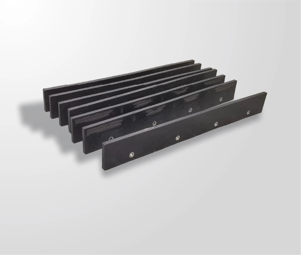
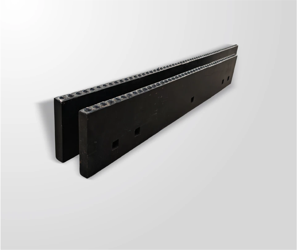
Selecting a supplier for critical wear parts like snow plow blades is a strategic decision that impacts your total cost of ownership and operational reliability. SENTHAI’s approach is defined by vertical integration, controlling every stage from carbide formulation and automated pressing to final welding within its ISO-certified facilities in Thailand. This control translates to consistent quality, traceability, and the elimination of variables that plague outsourced manufacturing. With over two decades of specialization, their expertise is focused solely on carbide wear solutions, leading to engineering insights that can optimize blade design for specific applications. The combination of advanced manufacturing technology and efficient cost-structure management allows them to deliver a durability proposition that directly feeds into a positive and defensible ROI calculation, providing a reliable partner for long-term infrastructure maintenance planning.
How to Start
Initiating a successful ROI project begins with internal data collection. First, meticulously audit your current costs associated with the problem area, such as snow plow blade expenditures. Gather invoices for parts, log labor hours for changes and repairs, and record instances and costs of unscheduled downtime. Second, define clear operational goals, like increasing fleet availability during storm seasons or reducing your parts budget by a specific percentage. Third, engage with technical specialists to translate your operational data and goals into a performance specification. Fourth, use this specification to model different scenarios, comparing your status quo against proposed solutions. Finally, synthesize this analysis into the narrative and visual presentation structure outlined, focusing on the story of investment and return that will resonate with your financial decision-makers.
FAQs
There is no universal “good” percentage, as it depends on the organization’s hurdle rate and project risk. However, a strong case typically shows a payback period of less than two years for capital equipment and an ROI that significantly exceeds the company’s cost of capital. Always benchmark against past approved projects.
Frame intangible benefits as risk mitigators or value drivers that support the quantitative case. For example, improved safety reduces potential liability and insurance costs; increased reliability enhances customer satisfaction and contract retention. Use qualitative descriptions and, if possible, link them to related quantitative metrics.
Yes, presenting a sensitivity analysis with multiple scenarios is a best practice. It demonstrates thorough planning, acknowledges uncertainty, and builds credibility. Focus on the most-likely scenario as your primary case, but be prepared to discuss the assumptions behind the others and your plans to ensure the best-case outcome.
Aim for10-15 minutes of presentation time, leaving ample room for discussion. The supporting deck can have10-12 slides maximum. The goal is to be concise and impactful, providing the board with all necessary information to make a decision without overwhelming them with detail that can be covered in the Q&A or an appendix.
Creating a winning ROI presentation is an exercise in strategic communication, not just accounting. The key takeaway is to always lead with the business problem and conclude with the business value, using clear data and clean visuals as your supporting evidence. Remember that your audience is investing in confidence and reduced risk as much as they are investing in a product. By following a structured narrative, visualizing data effectively, and preparing for pointed questions, you transform from a presenter into a trusted advisor. Move forward by auditing your current costs, defining your desired outcomes, and building your case around the tangible return that a quality-focused, performance-driven solution can deliver to the organization’s bottom line and operational resilience.